Welcome to new Curious Onlookers sent hither by the divine Kate Beaton, cheers Kate!
I hope no one’s put off by what will be a fairly long string of random meandering sorts of work-in-progress posts; User Experience will take me a while to put together and it’s sort of one big blob that’s hard to serialise.. you’ll see what I mean, eventually.
An unexpected tax refund and the film industry’s continued interest in Giant-Monster-strewn spectaculars resulted my profligate purchase of a 21″ Cintiq, which I got mainly for the large box it comes in in case I decide to do that book and have to move into it. The comic up until now has been drawn on a perfectly capable little 12″ model– if you’re not into these sorts of gadgets, a Cintiq is a computer screen you can drawn on, like an ipad I suppose but you use a stylus and it’s super-pressure-sensitive, so that it’s very much like drawing on paper, except with ‘Undo’. The drawing surface of the old one when you factor in the menus etc is about the size of a paperback book; the new one on the other hand is quite shockingly massive, as big as the big kind of animation paper and it dwarfs my laptop with isn’t small:

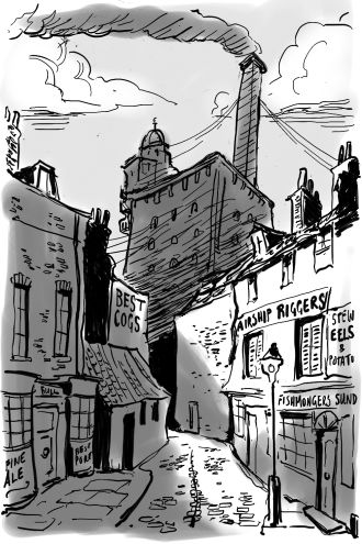
Aside from *yawn* actual work reasons, the main thing I had in mind for the bigger screen was backgrounds for the comic. Now I don’t know if you’ve looked closely at the comic at all (I advise against it) but behind those sloppy awkward characters gurning in the foreground are a few straggly lines that are meant to represent The Wider World they inhabit. Not that I’m much of a hand at landscapes anyways but for sure the small drawing area is more hampering there than it is for the characters. First experiments on the new screen:

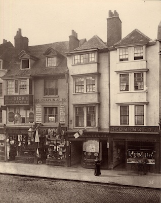
Room for improvement to be sure, but it would have been much harder to put that kind of detail on the little screen! Reference photos of London of this era I got from the gorgeous book Lost London, and this astounding post from Spitalfields Life (a great source of London lore in general).
This is the 1840-50s London of Lovelace and Babbage, demolished with gleeful abandon by the modernising Victorians and their railways and thoroughfares! Oooh I need to have somewhere Brunel smashing through these lovely old piles with a wrecking ball.. progress, people! While rickety and drafty and infested with mice, these buildings have one great advantage, viz, that there isn’t a straight line in them so it makes them much easier to draw.
The great problem now that the Wide World of Backgrounds is opening up to me, is that it’s tempting me sorely to abandon my commitment to black-and-white. Here at 2dGoggles we live in a binary world of pure good in the form of Science, pure evil in the form of the Humanities, and two states, black and white, which admit of no messy ambiguities. In some ways life is smoother lived this way, except when it comes to drawing backgrounds where it is a bit of a pain in the ass to be absolutely honest. If you look at the first drawing up there even if my perspective WAS correct, which it isn’t, it could never convey the same same sense of depth that two lazy minutes of throwing some grey washes on does:

I could appeal to the Deity for guidance, by whom I mean Will Eisner..

.. but even he used grey washes SOMETIMES! I shall experiment. Most of User Experience is set inside the Engine, which presents a host of difficulties, but maybe not ones of atmospheric perspective. We shall see.
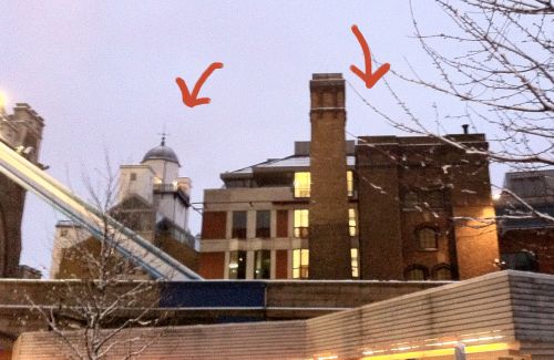
Oh by the way the Difference Engine building is based on two structures at the south side of Tower Bridge stacked on top of each other; in the geography of the comic it’s located in roughly the same place, without Tower Bridge of course which is too late period-wise, maybe a little further east down the river on the swampy, warehousey bit of Rotherhithe… Brunel’s tunnel isn’t far from there.

Each of these buildings is completely nutty in its own way, which is what makes them so very perfect for Babbage and Lovelace to inhabit.

Comments
17 responses to “The Wider World”
I actually like the first landscape better (although the second one does have nice light and shadow effect in it). My wonderful friend introduced me to 2D Goggles only a week ago and now I seem to spend all my free time here. Lovelace and Babbage are hilarious and I certainly have a tiny crush on Brunel, but most of all I love your footnotes! What geeky fun I’ve had! :)
21″ Cintiq http://www.wacom.com/cintiq/cintiq-21ux.php the video is all you need to know!
Wash, shmash — MORE FOOTNOTES!
Hello from a new Curious Onlooker! I have absolutely loved reading your comic, and loved falling in love with Lovelace, Babbage and [of course] Burnell. I’m currently studying in York (originally from America) and immensely enjoying every moment here. Today I went to the museum here and saw a tiny silver figurine of Burnell. It took a lot of willpower and reminding myself that tiny figurines don’t serve any purpose for me not to spend the 2 pounds. But it also reminded me that I had yet to actually come out of lurker mode and let you know how much joy this comic gave me.
thanks so much.
Agree with The Doodler, the grey washes really add to the lighting, as well as the depth. However I can see how that’s only part of a complete panel, and how that might complicate adding some foreground characters, albeit from my position of supreme ignorance.
I love the grey washes. I like both, but I love the sense of light in that one.
The grey is a little too flat but has a lot of potential, I think, if done a tad lighter. Although in truth I think more pictures of Brunel Being Awesome are more important than the shade debate.
I’ve always loved the Tower Bridge engine house rather more than Tower Bridge itself. It’s more eccentric and yet more honest – the kitsch skin on the bridge itself rather ruins its industrial grandeur. The Difference Engine building reminds me of the Tower of London too… is this intentional?
The increased workspace really lets you groove and move in that background scene! Excellent. As far as not having to do straight lines goes… well, better to do it with software than the old way of straightedge and pen/pencil, that’s certain! I speak from long years of being terrible with straight lines.
As to the washes, pretty much what all above, esp. Ceridwen, said. Suppose you wanted to do a peasouper fog atmosphere effect – what fun! But the pure line work is so good that its not like it needs the washes to be effective and engaging.
I was just pricing Cintiqs. Good on you for being able to get it, and am I envious? I? Nobody sells these things – including the smaller versions – used on amazon, so I guess that tells ya how cool they are.
I like both backgrounds. If it were just me, I’d expect to see the more minimalist pic as straight background while seeing the fuller washed pic as a scene-setter or for atmosphere or where the exact location actually matters as much as the characters. I guess it would all come down to intuition and you’ve got plenty of that when it comes to the comic!
Script-wise, your world-building has been fabulous so far; how nice it is you have acquired a gadget that will allow you to bring that attention to detail to the visuals. Well done, ma’am! Well done, I say!
Was that a fleeting refernce to a new upcoming episode I caugt in the midst of that? Prat tell what a “User Experience” is??!!
I think both the b&w and the washed cityscape look pretty good. There’s no reason why you can’t alternate!
Hooray for curious onlookers! This comic is my new favorite thing. :D
That Cintiq is really something. As for the gray washes, I think St. Eisner would say, “do what you need to do to tell your story.” I don’t recall seeing Caniff or Bill Watterson or Goseki Kojima use washes (actually, I’m not sure about Kojima now I stop and think about it), but that doesn’t mean you can’t. I thought the street scene was fine without them, fine in a different way with them, and I’m disinclined to tell you your business. :-)
“I’m disinclined to tell you your business”. Who are you, and what are you doing on the Internet? That kind of laissez-faire attitude won’t get you far. You need to go and find someone to be a jerk to, ASAP.
Either choice has possibilities. I look forward to the future.
WANT WANT WANT that cintiq! Use it well, lass.
I would just like to say that I actually preferred it before the gray shading (I’ve loved your style for all the lovelace and Babbage adventures and have been a follower since you began them).
Good luck with the new gadget. Hope to see new comics from it soon (in whatever style you chose). Hint…hint. :)